|
Listen To The Article
|
 The rising obesity epidemic due to overconsumption is driving countries to explore food labeling with enhanced visual impact.
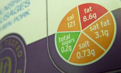
The front-of-the-pack, traffic light system of labeling introduced by the UK government is a laudable attempt to promote healthy food choices in the general population. This is the most comprehensive visual expression of the healthiness of foods so far, and has the potential of influencing the eating habits of millions of people.
Experimental studies conducted in Massachusetts General Hospital have shown that, when pre-packed meals contained labels of red, amber and green, to indicate their differing levels of healthiness, people tended to make healthier choices. On recording the buying habits of people for the same periods of time before and after the introduction of the colored codes, significant increase in the number of green-labeled meals was observed. This was most apparent when the meals with traffic signal labels were displayed prominently at eye level, clearly demonstrating the effect of the easily recognizable visual cues.
The Importance of Highly Visual Food Labeling
We do have an analytical mind, but often, we fall back upon certain familiar patterns, or schemas, to sort through the information available to us, especially when faced with an information overload. That is usually the case when we are presented with all the nutritional information on the back of products.
In countries like India where vegetarianism is based on religious sentiments, a simple green dot within a green square has become an extremely easy tool to pick out processed food items suitable for vegans. Even very young children learn to look for the green dot on the pack before eating any store-bought food items.
A typical grocery shopper may have to choose up to a hundred different products from among the thousands available on the supermarket shelves; that’s a lot of math to handle for even the most meticulous person. Traffic lights are a strong, easy to use, schema that can communicate to us faster than information expressed in letters and figures.
Other visual symbols in food labeling
1. The Heart Tick
The Heart Foundation’s Tick [1] which has been in use in Australia for over two decades has seen the people of that country and of New Zealand successfully making heart-healthy choices. Positive parameters like dietary fiber, whole grains, calcium and real fruit content in juices are taken into account, along with total energy value, and negative parameters like fat and sodium content, while assessing each product prior to awarding the tick.
This not-for-profit system of independent assessment earned the trust of the consumers, and the industry was quick to take note of it. The Tick is an optional label, but the food companies, realizing its value, voluntarily tailor their products to meet the strict requirements of this labeling. The heart foundation also works with industries to alter their formulation in order to make the products more healthful. Consequently, over 1700 food items carry this mark, providing Australians a wide choice of healthy foods.
2. The Star System
Australia’s Heart Foundation has recently introduced star-rating for food products, starting from half a star at the bottom of the scale, to five stars for the healthiest foods. This front-of-the-pack labeling comes closer to the traffic lighting advocated by UK, and makes straight-forward comparison of products simpler than in the traffic light system.
Prepare now for surging food costs and empty grocery store shelves… [2]
3. The Check Mark
American Heart Association has a check mark for heart-healthy foods based on the FDA-approved single servings, but its scope is limited even after the modifications done in 2011. The products that carry the Heart Check mark are definitely good for you, but the number of food products eligible for it remains few. The manufacturers are required to pay an administrative fee to the AHA too, unlike the no-cost Australian Heart Tick and the Nordic Key Hole.
4. The Green Keyhole
Sweden’s Green Keyhole symbol has been embraced by other Nordic countries like Norway and Sweden. Eventual extension of its coverage to all of the Nordic nations would safeguard the health of all Nordic people, while enabling the free movement of certified foods across borders.
5. Finland’s Heart Symbol
Following Finland’s successful campaign to reduce heart-related ailments with mandatory labeling of the salt content in food products, the heart symbol was introduced to mark heart-friendly choices among the packaged foods sold in that country. But they were considering the integration of the Green Key as well, for uniformity among all Nordic nations.
6. Healthier Choice Symbol
Most undeveloped African countries are still grappling with hunger alleviation; while many developing nations in Asia are more concerned with the safety of food products. Almost all the governmental efforts are geared to ensuring hygiene, and stemming food adulteration.
There are many food laws in place to prevent misleading health benefit claims of food items, but the Healthier Choice Symbol instituted by the Health Promotion Board of Singapore is worth a mention. Spanning 60 categories of foods, this symbol stands for a better choice among the available products, with 70 percent of the population sensitized to it.
7. NuVal Score
This independent system developed by a panel of medical professionals and nutritionists uses a complicated algorithm to simplify the nutritional value of foods into a single number between 1 and 100. Over 30 parameters are considered towards the score. The numerical expression helps in hassle-free comparison at a glance.
The Downside of Traffic Light System
The traffic lighting of food products is not a foolproof solution to unhealthy eating and obesity. For one thing, the labeling is just a visual tool for quicker comparison of a few contents that are well-known risk factors of heart disease and obesity. The percentage daily values are given for 100 grams, and the confusion regarding serving sizes, as well as the number of servings per pack, remains. You are also left with comparing 3 greens and 1 red on a product, to 2 greens and two ambers on another one.
Bowing to industry pressures, the amber color now accommodates a wider range, and may not be an accurate measure of the healthiness of the foods being compared. Another concern is that, since only sugars, fats and salt content come under the scanner, manufacturers may introduce other harmful additives to the food to avoid the red label.
If a soft drink manufacturer wants to avoid being red-lighted, sugar content can be adjusted to meet the limits, while using artificial sweeteners to keep the sweetness at current levels. The same goes for the addition of taste-enhancing substances like monosodium glutamate to make up for lowered sodium chloride content.
The Need to Popularize Traffic Light Labeling
In spite of the shortfalls, the universal recognition of these 3 colors, and their meaning, gives traffic light labeling the potential of being an effective system. This simpler and quicker way to assess the healthfulness of food products, albeit not being a perfect solution, is by far the most visual. That very fact has put many food industries on the defensive, and their pressure tactics seemed to have worked yet again.
If the other countries follow this highly visual system, maybe with slight variations to incorporate the direct comparability of the Star system of Australia, or the numerical expression of NuVal, it could revolutionize the food industry as a whole. But, as of now, traffic lighting of foods have found acceptance in UK and Ireland only.
Nevertheless, if this new labeling proves to be effective in reducing obesity and other health issues, it will not be long before others find it worth emulating. After all, “the proof of the pudding is in the eating.”
 [3]
[3]